Reliant Health Partners, an Inc. 5000 company, is an innovative medical claims repricing service provider, and had been relying only on personal referrals for over a decade. With new ownership and big goals for the future, it needed to signal these changes without losing sight of its identity. Its bold new brand identity highlights what differentiates it, working to both strengthen its existing relationships and attract new customers.
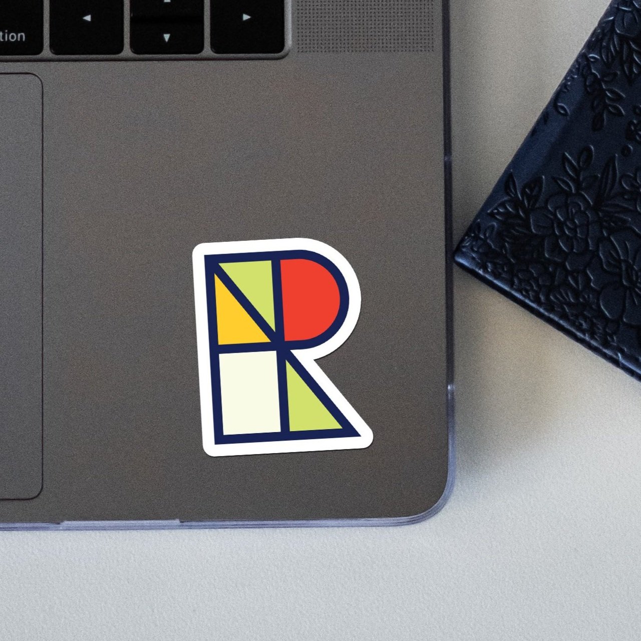
The custom monogram expands into a system of geometric patterns, a nod to Reliant's data-centric approach, and the unexpected color palette evokes dependability, dynamism, clarity, and innovation. The abstract photography represents the concepts of scale (referencing the tagline "Maximize Savings. Minimize Noise.") and humanity. The result is a brand identity that reinforces Reliant's vision, strongly differentiates it, and paves the way for future growth.